Designed and built a companion app for a premium sunlight machine, from workshop to App Store.
TL;DR
Sunday Light needed a companion app for their sunlight machines. Without one, customers couldn't set up devices, control their lights, or get firmware updates. I designed and built it in Flutter, from discovery workshops through App Store deployment, including BLE hardware integration that needed continuous refinement across the full MVP timeline. The final version provisions devices over Bluetooth, controls brightness and color temperature, and has a Living Light interface where the UI mimics the actual light, matching both color temperature and brightness in real time.
96.8%
Accessibility Resolved
2
App Stores
App Store + Google Play
v1.9.1
Sustained Releases
continuous cadence post-launch
MVP
On Schedule
Engagement continued
"Great communication. Rare skillset." - CEO, Sunday Light
Quick Facts
| Company | Sunday Light Limited (London, UK) |
| Role | Product Designer & Developer (sole designer + developer) |
| Team | CEO/Product Owner, backend engineering, firmware engineering |
| Platform | iOS + Android (Flutter) |
| Timeline | 5.5 months (Oct 2025 to Mar 2026) |
| Tools | Figma, FigJam, Flutter/Dart, Riverpod, BLE (ESP32-S3), CodeMagic CI/CD |
| Responsibilities | Discovery workshops, IA, wireframes, UI design, Flutter development, BLE integration, CI/CD, App Store submission, accessibility audit |
The Client
Sunday Light makes premium indoor sunlight machines: water-cooled, professional-grade, shortlisted for Dezeen Lighting Design of the Year, covered by Financial Times, WIRED, Wallpaper*, Women's Health, and Fitt Insider. Their companion app needed to match.

The Challenge
The companion app was never optional. Without it, customers couldn't set up new devices, control their lights, or receive firmware updates. The app would make every unit already in customers' hands actually useful.
The hardest part was BLE device provisioning: getting a phone to talk to an ESP32-S3 chip over Bluetooth so the light could join Wi-Fi for the first time. The CEO had rejected SoftAP because it was too confusing for users who'd see a "no internet" warning mid-setup. Once provisioned, the app needed real-time device control (brightness, color temperature, presets, scheduling), responsive enough that adjusting lights feels direct, not laggy. And the whole experience had to match the hardware. A Dezeen-shortlisted light can't ship with a generic companion app.
What I Built
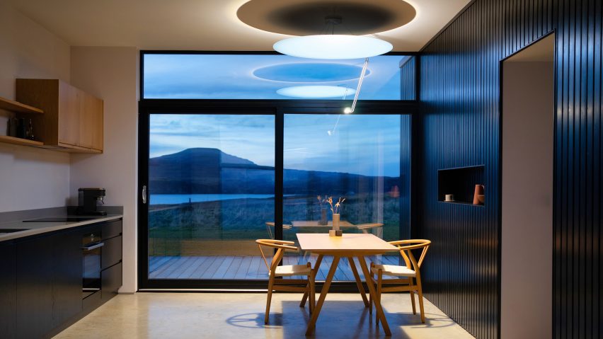
A companion app that follows industry conventions but feels like it belongs next to the hardware. Device control, BLE provisioning, room and zone management, automation presets, and a Living Light interface where the UI mimics the actual light, shifting color temperature and brightness to match the physical device.


The Process
I shortened the design process deliberately. Discovery workshops and information architecture came first, then wireframes in Figma where we agreed on the designs. From there I moved straight into a BLE test project to verify the concept worked before building the full MVP.
The app hit TestFlight twice: first during BLE integration to prove provisioning was possible, then again with the complete MVP. CI/CD was configured on day one. Every merged PR triggered a TestFlight build, which made every release a design review opportunity for the London team. After the MVP shipped on schedule, the engagement continued with new features and the App Store launch on both iOS and Google Play. The final phase brought Living Light, the accessibility audit, the full test suite, and the AI workflow that accelerated everything.

Decision 1
Designed the UI Around the Light: Ambient Screen Tint and Direct Control From the Home Screen
Context
The app's visual identity and interaction model went through four phases: default Flutter Material, a monochrome wireframe aesthetic after the CEO said "You got taste. I trust you," an abandoned Notion-inspired redesign, and finally Living Light, which solved both the visual identity and how users interact with their lights day to day.
I built a design system around structured blocks: clean cards, consistent spacing, a neutral palette with subtle hierarchy. It looked polished in Figma. But on real screens, the app felt like a productivity tool. Not a companion for a high-end light. The design system organized information well but communicated nothing about sunlight, color temperature, or the physical experience of standing under the light. I scrapped it after two weeks. The question that unstuck things: what if the app showed you what the light actually looks like? That became Living Light.
Options considered
| Option | Considered? | Outcome |
|---|---|---|
| Continue monochrome UI | Yes, stable but felt static and disconnected | Functional but lacked premium feel |
| Standard branded theme | Yes, CEO wanted fast implementation | Too generic for this product |
| Notion-inspired design system | Yes, attempted then abandoned | Did not align with product identity |
| Living Light ambient UI + direct-control cards | Selected | App mimics the light and puts controls on the home screen |
What I chose and why
Living Light makes the app mimic what the actual light looks like. I built AmbientBackground to aggregate device CCT and brightness values, interpolate colors, and tint the entire screen accordingly. Dual-glow cards, nav bar tint, spring-based physics animations replacing linear transitions. The UI gets warmer and dimmer as the light does. Glance at the app and you know what the room looks like.
The other half of the design evolution was the light cards themselves. Through continuous testing and feedback, I designed the cards so users could control brightness, color temperature, and presets for each light or room directly from the home screen, without navigating into individual light pages. That came from watching people use the app: most adjustments are quick, and forcing a page navigation for every brightness tweak made the app feel slower than it needed to.

Building AmbientBackground meant working with color temperature interpolation and brightness curves. I wouldn't have written that code without the design goal driving it.
The CEO started prescriptive: follow industry conventions. After the BLE breakthrough and the monochrome UI, trust shifted. "You got taste. I trust you." By the time I proposed Living Light, the autonomy to pursue it was already there. Earned through shipped work, not promised in a pitch.

Decision 2
Built a Production BLE Provisioning System: Forking Native Libraries When Every AI Tool Failed
Context
BLE device provisioning (the flow where a user connects their phone to the Sunday Light for the first time) was estimated at 6 days. A working version existed early on, but it took continuous refinement over 6 weeks until the MVP release to reach production quality.
Options considered
| Option | Considered? | Outcome |
|---|---|---|
| SoftAP (WiFi-based provisioning) | Yes, CEO rejected it; too confusing for users mid-setup | Better UX with BLE but harder technically |
| Standard BLE library (Espressif) | Yes, failed due to Swift version mismatch on iOS | Required forking the library |
| AI-assisted debugging | Yes, "They kept taking me in loops" across 3 days | Solved manually |
What I chose and why
I forked the native Espressif library to resolve the iOS Swift version mismatch, then built a 3-layer bridge architecture: native iOS/Android, Flutter bridge, and Dart layer, each handling platform-specific BLE implementations.


I designed 6 error categories with specific recovery actions: Wi-Fi auth failure shows re-enter password, network not found opens Wi-Fi selection, session error returns to device selection. Each of those was simultaneously a UX call and an architecture call.


What I gave up
Byte-level protocol work is unusual UX engineer territory. The technical investment went deeper than a typical companion app: debugging raw BLE characteristic writes, interpreting firmware error codes, working directly with the ESP32-S3's provisioning protocol. What was estimated at 6 days needed continuous refinement across the full MVP timeline. Cross-platform BLE is that unpredictable. But owning both design and development meant every UI decision accounted for BLE constraints immediately. There was no handoff and no spec document, so nothing got lost when the hardware didn't behave.
Decision 3
Designed for Unreliable Conditions: Circuit Breaker, Optimistic Updates, and Offline-First Patterns
Context
Backend APIs were still evolving alongside the app, and BLE communication adds inherent latency on every command. If the app feels slow when you drag a brightness slider, it doesn't matter how clean the code is. The app had to feel fast regardless of backend state.
Options considered
| Option | Considered? | Outcome |
|---|---|---|
| Simple retry on failure | Yes, evaluated early on | Led to unresponsive states during authentication; rejected |
| Standard loading states | Yes, laggy feel with BLE latency | Users notice lag on controls they use daily |
| Circuit breaker + optimistic updates + offline-first | Selected | Responsive UX regardless of backend state |
What I chose and why
I built a circuit breaker pattern for unreliable auth that tracks consecutive failures, opens after threshold, and falls back to in-memory repos. Optimistic updates with rollback keep the app feeling responsive: user taps, UI updates immediately, API call follows, rollback only on failure.

In practice, optimistic updates meant the brightness slider tracked your finger in real time. Drag it from 40% to 80%, and the UI shows 80% the instant you move. The BLE command fires in the background. The physical light catches up 200-500ms later. If the command fails (device disconnected, BLE write timed out), the slider rolls back to 40% with a brief error indicator. Without this pattern, every slider adjustment would pause, show a spinner, wait for the round-trip confirmation, then update. On a product where adjusting light temperature is the core interaction, that lag would make the app feel broken.

Per-device interaction lock prevents poll readback from overwriting a user's active slider drag. It auto-expires 5 seconds after the last command and is wired into all 11 command entry points. Without this lock, the app's polling cycle would snap the slider back to the last-known server value mid-drag. The user would literally fight the UI to make any adjustment.
What I gave up
Three resilience systems (circuit breaker, optimistic updates, interaction lock) layered on top of standard state management. Debugging failures meant tracing through all three layers to find where a state mismatch originated. More complexity than a typical companion app warrants. But users adjusting their lights multiple times per day notice every dropped frame and every spinner.

Decision 4
Shipped to App Store with 703 Tests and 96.8% Accessibility Resolved
Context
The CI pipeline processed ~195 builds over 4.5 months. On peak days, 10+ builds went through CI in a single day.
Options considered
| Option | Considered? | Outcome |
|---|---|---|
| Ship features, fix quality later | Yes, pressure existed | Technical debt compounds; rejected |
| Manual testing only | Yes, insufficient for solo practitioner | Cannot maintain quality across 344 files alone |
| Automated testing + accessibility audit + CI/CD | Selected | 703 tests, 96.8% a11y, confidence to ship |
What I chose and why

The accessibility audit (62 items identified, 60 resolved) touched both Figma designs and Flutter code. Flutter widgets are invisible to assistive technology by default, so I annotated every interactive element with meaningful screen reader descriptions. All 9 images that shipped without alt text received labels. Touch targets below 44pt were resized. Contrast ratios across the Living Light ambient backgrounds were tested at multiple color temperature values to confirm legibility at both warm and cool extremes.
On the engineering side, Flutter's semantics tree required explicit annotation. Unlike web where HTML elements carry implicit roles, Flutter widgets are invisible to assistive technology by default. I wrapped controls in Semantics widgets, added excludeSemantics to decorative elements, and tested with both VoiceOver (iOS) and TalkBack (Android). The remaining 2 unresolved items were platform-level constraints outside app control.


I configured CI/CD on day one: CodeMagic with 3 workflows. Every TestFlight build was a design review opportunity for the London team.
TestFlight became the quality process, not just distribution. Every merged PR triggered a build, so the London team was testing on real hardware continuously.
How I tested. Internal usability and accessibility passes ran throughout the build, not at the end: a 62-item accessibility audit (60 resolved), six dedicated accessibility test suites covering contrast, keyboard navigation, screen readers, text scaling, touch targets, and semantics, and continuous TestFlight reviews with the London team on real hardware. AI assisted the unit, visual, and accessibility test writing; every AI-suggested change still passed the same human review bar.
What I gave up
Every hour writing tests and annotating semantics was an hour not spent on the feature backlog. Planned features stayed queued longer than they needed to. But 703 tests and 96.8% accessibility compliance meant I could ship without worrying that a BLE regression would brick onboarding for every new customer.

Reflection

I went through a design process, but I shortened it on purpose. Discovery workshops, information architecture, wireframes in Figma, then straight into building and testing on real devices. The IA and user flows were completed one day before the first commit. The quicker I can get something running on actual hardware, the faster I find out what's wrong with my assumptions.
Design autonomy wasn't given to me upfront. Early on, the CEO gave prescriptive direction: follow industry conventions. After the BLE breakthrough and the monochrome UI, trust shifted. By project end: "Great communication. Rare skillset." That progression matters more than starting with creative freedom.
703 tests and 96.8% accessibility compliance. That was a business call, not perfectionism. Without that safety net, I'd have been too nervous to move fast.

