Five Dark Modes Later
It took five attempts to get dark mode right on my own portfolio. Here is what each failure taught me about base colors, elevation, and why the ground matters more than the surfaces.
Tagged
Product design from research through shipped code. Case studies covering mobile apps, web platforms, desktop tools, and design systems.
19 results
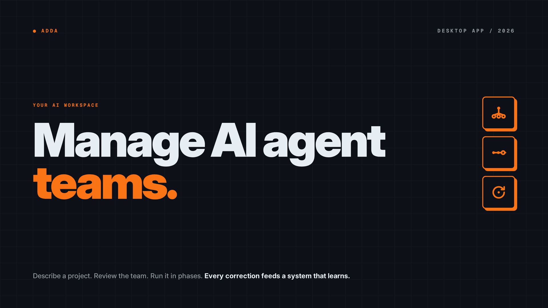
Designed a desktop AI agent workspace where teams of AI agents collaborate on projects, with structured context management, sandbox security, and an evidence-backed learning pipeline.

Redesigned a healthcare clinic's revenue cycle management from patient intake to payment collection. Solo UX design, 6-week sprint, shipped to production.
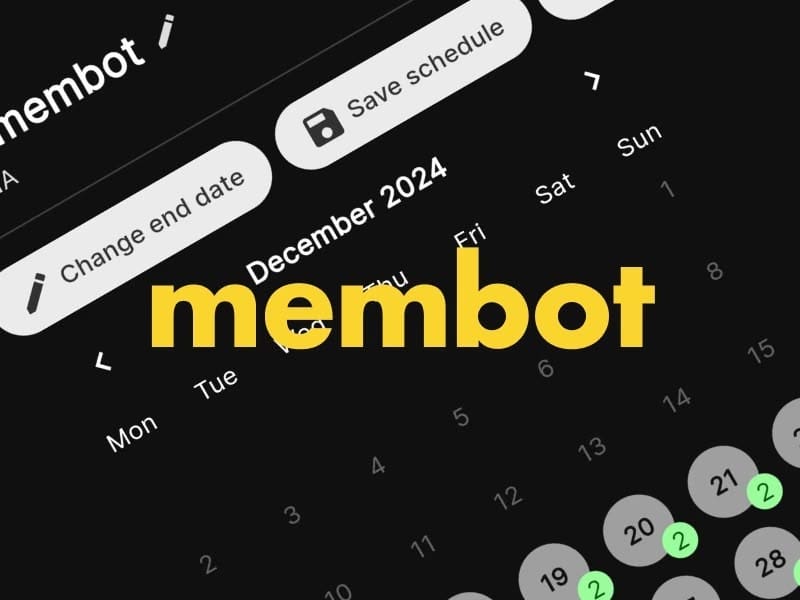
Built a Figma design system at seed stage, then rebuilt it twice for a rebrand and clinical regulation. Token architecture absorbed ~40 features and two team transitions with zero sprint delays.

How we designed an inclusive sexual health platform for the LGBTQ+ community where regulatory compliance and user dignity were the same problem. 6 certifications, mobile and web.
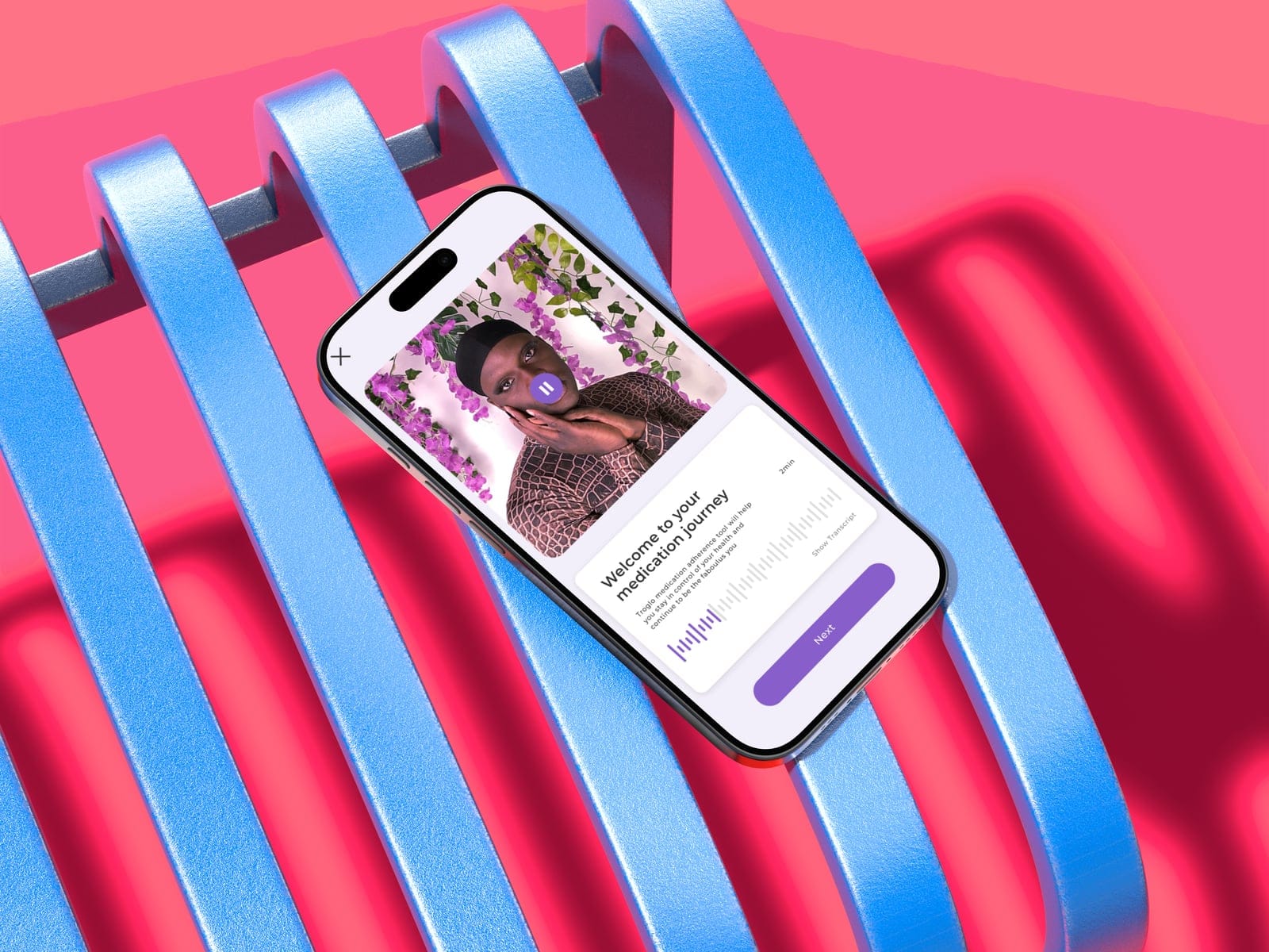
Designed and shipped a cross-platform Flutter companion app for a screenless NFC medical device, from discovery workshop through App Store and Google Play launch.
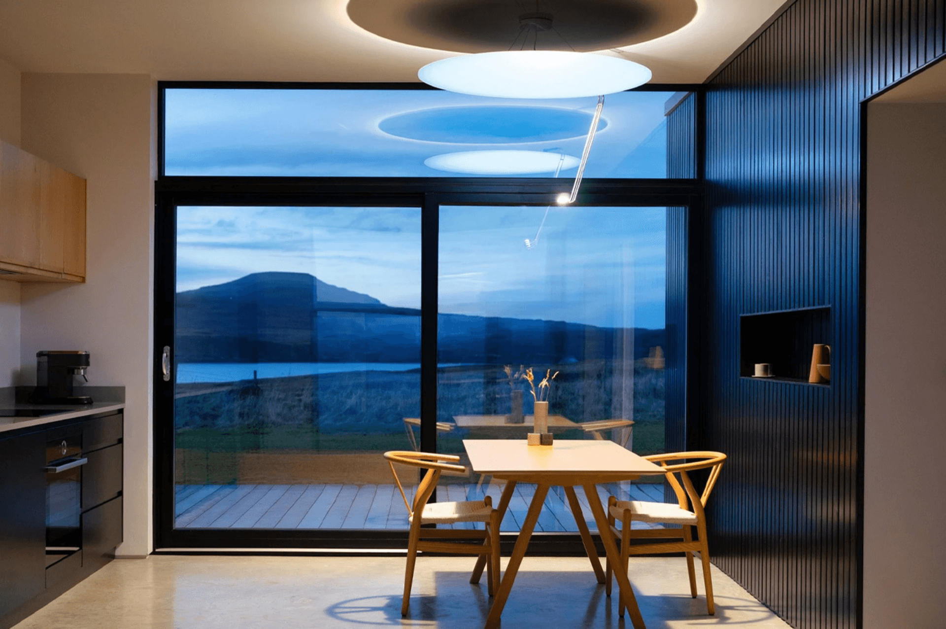
Designed and built a cross-platform Flutter companion app for a premium IoT sunlight machine, from workshop through BLE integration to App Store and Google Play launch.
It took five attempts to get dark mode right on my own portfolio. Here is what each failure taught me about base colors, elevation, and why the ground matters more than the surfaces.
Regulatory requirements and hardware limitations are not obstacles to work around. Read them correctly and they tell you exactly what the product has to do.
Hardware latency you can't remove is still a design material. The craft move is converting a wait into something that reads as feedback.
Ban blur, gradients, and opacity from a design system and something unexpected happens: the decisions get harder, and the results get more honest.
When two user groups share one system, a feature does not carry one meaning. Designing for both requires holding two opposed readings of the same screen at once.
When a team deadlocks on an interaction model, arguing harder just hardens positions. Build both options and let the evidence end the debate before it becomes a conflict.
A senior product designer role and a design-engineer role may both fit you. They are not the same reader.
The instinct to lay a solid foundation before drawing a single screen is backwards. Building the system alongside the screens is what makes both finish on time.
Feature count debates miss the point. When your users are vulnerable, every added setting is a new failure mode, and cutting scope becomes a form of harm reduction.
When your interface lives on two devices, the user can only look at one. Sound, haptics, and invisible latency absorption become your real design tools.
I have ADHD. Most learning tools ignore that. So I built one that doesn't.
Node graphs demo beautifully with 5 nodes. At 15 they become unreadable. The problem is topology, not tooling.
The right prototyping tool depends on the question you're trying to answer, not the phase you're in. Sometimes paper beats Figma and code beats both.